Commons:Featured picture candidates/File:Saint-Maimbœuf church.jpg
Jump to navigation
Jump to search
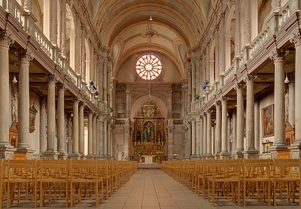
File:Saint-Maimbœuf church.jpg, featured[edit]
Voting period is over. Please don't add any new votes.Voting period ends on 2 Jun 2010 at 07:47:27 (UTC)
Visit the nomination page to add or modify image notes.
 Info created by ComputerHotline - uploaded by ComputerHotline - nominated by ComputerHotline -- ComputerHotline (talk) 07:47, 24 May 2010 (UTC)
 Support -- ComputerHotline (talk) 07:47, 24 May 2010 (UTC)
 Neutral Very good, beautiful picture (single shot, no HDR?), but the photographer is not on the axis of the nave and the picture is not centred. This is slightly disturbing. --Eusebius (talk) 16:46, 24 May 2010 (UTC)
 Info In fact, this is an HDR image. In a church, you can't make a good photo without using HDR method. --ComputerHotline (talk) 19:28, 24 May 2010 (UTC)
 Support - very nice. I don't find being slightly to one side disturbing. Jonathunder (talk) 17:04, 24 May 2010 (UTC)
 Oppose agree with Eusebius. Furthermore, I see a bad light in the rose window (CA ?), the crop is not symmetrical, and the pic is a bit tilted, or suffers of a little perspective distortion due to the position of the photographer (look at lines on the ground). Enough to oppose with regrets, IMO.--Jebulon (talk) 17:37, 24 May 2010 (UTC)
 Neutral -- This is a very good photo indeed. But not excellent because of the flaws mentioned above. Alvesgaspar (talk) 18:23, 24 May 2010 (UTC)
 Support --The High Fin Sperm Whale 18:27, 24 May 2010 (UTC)
 Neutral Solid good quality shot. But the off-center position and the HDR are putting me a bit off. Lighting looks dull and lacks contrast in the lower portion of the image. This seems like a pretty standard church shot. --Dschwen (talk) 20:17, 24 May 2010 (UTC) P.S.: what software was used for the HDR/tone mapping? --Dschwen (talk) 20:18, 24 May 2010 (UTC)
 Info Photomatix was used for make it. --ComputerHotline (talk) 17:29, 25 May 2010 (UTC)
 Neutral That's an eye catching shot, and I think opposing based on slight centering off would be nitpicking, but I also feel it's disturbing on architectural subject, like good care wasn't taken while preparing it. Stained glasse is partly blown out, despite 3 (or more ?) exposures tones mapping. - Benh (talk) 21:53, 24 May 2010 (UTC)
 Support --LuisArmandoRasteletti (talk) 20:12, 26 May 2010 (UTC)
 Support --Brackenheim (talk) 16:43, 27 May 2010 (UTC)
 Support –It's really difficult, to make this better. It harms that the photo is not in the axle. --Steindy (talk) 22:22, 1 June 2010 (UTC)
Confirmed results:
Result: 6 support, 1 oppose, 4 neutral → featured. /George Chernilevsky talk 13:39, 2 June 2010 (UTC)
This image will be added to the FP gallery: Places/Interiors
